We have designed a 3-month course for the best complete graphic design course in Bangalore. It is an intense, in-depth program that will make you an expert in graphic design which can help you start a career or freelance to earn good income.
The diploma course combines both short-term and advanced course modules. There are different software the two courses cover – Photoshop and Adobe Illustrator respectively. In the diploma course, Adobe Indesign will be added, so you will learn how to use the software– Photoshop, Adobe illustrator and InDesign.
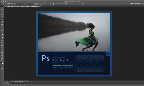
The diploma course combines short-term and advanced course modules. In short term, the subjects below are covered:
Introduction To Graphic Designing
Introduction To Software (Photoshop)
Photo Editing
Photo Manipulation
Photo Retouch
Creating Designs For Web
Creating Designs For Print
Logo Design
Icon Design
In the advanced course, the subjects below are covered:
Introduction To Graphic Designing
Introduction To Software (Photoshop And Adobe Illustrator)
Elements In Design
Principles In Design
Color Theory
Photo Editing
Photo Manipulation
Photo Retouch
Creating Designs For Web
Creating Designs For Print
Logo Design
Icon Design
In this course which combines short-term and advanced course modules, you will learn in-depth all about the graphic design industry, where the skills are applied, types of graphic designs, and the scope in the industry. You will learn more about logo designs, elements and principles of design, how to edit, manipulate and retouch photos like an expert, on Photoshop, Illustrator and InDesign. You will also be working on live projects.
Graphic design has evolved so much since its inception that it is now one of the most sought after skills that can be applied in a wide range of industries. Graphic designers make everything worth paying attention to.
The subjects covered in the introduction to graphic design are:
Before computers, graphic design is known to have existed long before, dating back to 100 AD, where icons, images, and text were used. The industrial revolution paved a new road for graphic design during the 18th century. Lithography which emerged from new technologies upgraded the printing technique in graphic design.
Today, you can see it everywhere – TV commercials, billboards, posters, on the internet, websites, social media, packaging, etc. it has become a staple for marketing and advertising with no limit on creativity. Advertising agencies have a wide scope for graphic designers.
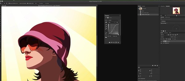
In this course, you will learn to use three different software – Photoshop, Adobe Illustrator, and InDesign. Adobe Photoshop is one of the most widely used software in graphic design with many versions available like Photoshop CC, Photoshop Lightroom, Photoshop elements, etc. it is available on macOS and Windows computers. Widely used in photo editing, manipulation, and retouching, Photoshop serves its purpose for a wide range of graphic designers and digital artists.
Adobe Illustrator, on the other hand, is mostly used for illustration, drawing, and creating digital art by graphic designers, artists, and animators. Also used by architects for illustrating buildings, the vector quality of the works is high.
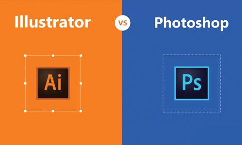
The difference between these two software is that Photoshop is Raster-based whereas Illustrator is vector-based. Images and logo design can not be enlarged or compressed without compromising the quality of Raster-based software.
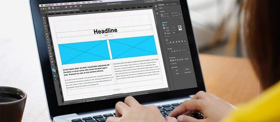
Adobe InDesign is used to create web page layouts, posters, flyers, magazines, newspapers, and books for both digital and print media.
How To Use The Three Different Software
The Purpose Of Each Software
How To Master The Tools In Each Software
How To Create Designs For Digital And Print Media In Each Software
How To Create Web Pages In InDesign
Edit, Manipulate Photos In Photoshop
The Basic Elements In Design Come Together In Harmony And Balance With Rhythm To Create Something Wonderful That Communicates An Idea Elegantly And Creatively.
You will learn how to master the elements in design which consist of:
They are applied to the elements of design to make the work complete and add value to the composition. Any design has to follow the principles to make it stand out and visually interact with the viewer. Without elements, principles can not function, and vice versa.
As a graphic designer, you are required to have a sound knowledge of how to apply the principles of design to its elements, if you want to create a great design.
The main principles of design that you will learn to master here are:
Color is everything. It sets the mood, appeals to the eye, makes a product look enticing. 90% of people will try a product if they like the color of it or the packaging. The right combination is enough to sell a product. In graphic design, it’s just as important to appeal to the eye of the viewer and make them curious about the story behind the design.
Graphic design uses the color modes RGB (Red, Green, Blue), and/or CMYK (Cyan, Magenta, Yellow, and Black). CMYK is a subtractive color model when light is removed from the paper. It originally had primary colors. RGB is an additive color model where light is added.
Colors evoke emotion in the viewer, so to evoke a particular emotion, brands use a particular color. They are the final element in making a sale. The colors in McDonald’s logo are used to evoke hunger and craving. Black symbolizes authority, blue for dependability, and brown for masculinity. Some law firms use black and brown in their designs.
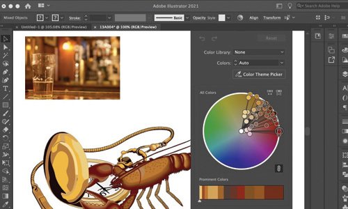
One of the most important elements in brand identification is the logo. They are a window for the customers, giving insights into the brand. A good logo leaves a lasting impression on them like Nike’s, Apple’s, Audi’s, Allen Solly’s, Starbucks, etc. The logo of these brands has created a reputation and credibility around them, and people recognize them instantly.
Some logos do not have typography but can be instantly recognized, as the logos of Mercedes, Apple, and Starbucks. And some have typography or text without images like H&M, Lenovo, etc. Some have a combination of both image and text like Royal Enfield, Allen Solly, Samsung, etc. these logos have gone through changes over the years and will be remembered for a long time.
Key elements to bear in mind while designing a logo:
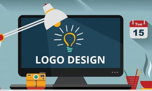
Icons are those small images or symbols you see on mobile apps and on roads that give instructions or tell what something is. You also see them on products that say they are chemical-free, natural, and handmade, illustrated in small images.
Why are icons important? They communicate easily with the viewer or customer, especially if they can not read or know a language. Icons are one of the most important visual modes of communication which everyone can use and interact with, without the hassle of misunderstanding and misinformation.
They use less space than text and take less time to read.
Icons can illustrate almost anything from warnings, instructions, genders, ages, contents in a product, etc. They can differ in shapes, color, transparency, and sizes.
Some key points to bear in mind before designing an icon:
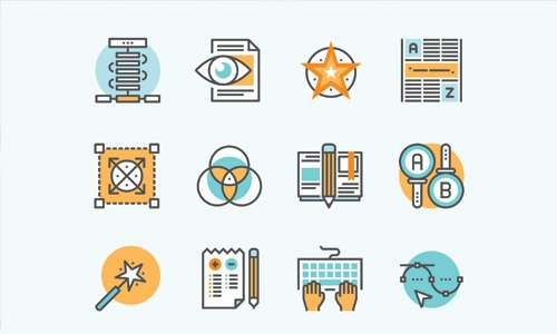
Mostly done on Photoshop, Photo editing is the process of altering an image with respect to its size, color, contrast, background, etc. It is often confused with Photo manipulation and photo retouching, which are very different terms. Photo editing makes an image or a photograph presentable.
In advertisements, Product photos are edited to make them more appealing or appetizing. Photo editing can be a great tactic in advertising products from clothes to food and beverages. They are also common in Instagram and Snapchat, which are photo editing and sharing social media apps. Photo editing serves its purpose in many industries like fashion, magazines and newspapers, display ads, photography, graphic design, etc.
Popular photo editing software used are Photoshop, Canva, GIMP, Microsoft paint, etc. As a professional photographer, being skilled in photo editing is a must. Before printing pictures in magazines and newspapers, they are edited by professionals to make them more appealing. Any other altercation to the elements in an image will come under photo manipulation.
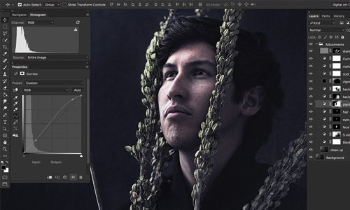
To alter an image on another level, like changing the skyline, twisting buildings, or any objects, changing the texture of the skin, is to manipulate the photo. You can get as creative as you want in manipulating a photo. It is used by graphic artists, photographers, advertisers, etc. Photoshop is the most widely used software to manipulate photos.
Widely used in journalism, fashion and advertising, photo manipulation has been misused from time to time, even frowned upon. It is also used to produce artistic photographs that can amaze the viewer and be appreciated. Unique images and optical illusions can be achieved by photo manipulating multiple images. There are different techniques in photo manipulation that you will learn here in this course.
Photo manipulation changes the pixel and can be hard to undo in Photoshop. But a non-destructive method can be adopted to make changes easily and undo the changes.

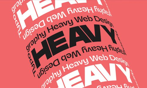
Typography is the art of arranging text in different sizes and fonts to visually appeal to the reader. An interesting font can make the brand look sophisticated or fun, depending on the font type. You can even design your own font. Typography is the most fun part of graphic design.
Why is typography important?
Like the logo, typography is an important part of a brand’s identity. It adds weight to the brand’s persona and grasps the attention of a customer if it is interesting. A good typeface on the product is enough to grab the attention of a customer. A boring typeface or font will bore the customer as well. Moreover, typography builds recognition over time. Example: Lenovo.
Typography influences how the reader digests and perceives the information conveyed. Comic books have a unique font that makes it easier for the reader to digest the information and have fun reading it.
There are different elements in typography – typeface and fonts. A typeface is a family of similar fonts. It is like a genus and different fonts are like species of the same genus. Font varies in thickness, weight, and styles. For example, Helvetica is a typeface and Helvetica regular, Helvetica Oblique are fonts.
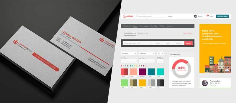
Branding is a practice of distinguishing yourself from your competitors by creating an identity and design that makes your brand a better choice. It includes logo designing, advertising, product designing, web designing, and more. Most people think of branding like logo design but it goes beyond that and covers everything that makes a brand unique.
Why is branding important?
What Is Branding
How To Develop The Voice And Persona Of A Brand
Logo Design
Create Content And Tone Of The Brand
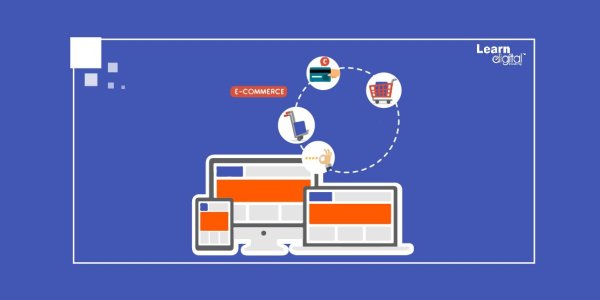
A website that is visually appealing, creative, and ignites interest in the viewer makes a brand look approachable. It’s all about how a brand presents itself on the web. A brand may be good in what they do or offer, but having a poor website is detrimental in lead generation and establishing an identity.
Creating elements of a website – design, layouts, navigation, content, product images, and call to action buttons are all the job of a web designer. As a graphic designer trained in UI and UX, you can create a website that meets the client’s expectations and requirements.
A website has to reflect the brand, their persona, and values. it leaves a lasting impression on the visitor. Corporate companies have websites that look formal and elegant; creative industries like animation and film have artsy websites that look playful. Like so, different industries have different themes in their websites that reflect the business and give an insight to the customer into the nature of work and the mood of a company.
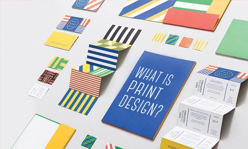
Creating brochures for print, business cards, menu cards, pamphlets, banners, posters, album and book covers – all come underprint design. A combination of photo editing, photo manipulation, typography, and logo design is required.
Not all graphic design agencies will do the printing, so it’s important to choose the right print vendor before/after having the required designs made.
Key points to bear in mind while creating design for print:
A web page is a document displayed on a website. Simply known as a page too. Referring to web pages, there are different elements that most businesses have:
Difference between a web page, website, and web server: A website is a collection of web pages connected together. A page is a component in a website – home page, about us page, our products page, blog page, contact page, and more. A web server is a web hosting computer.
Any business having an online presence must have web pages that provide relevant information to the customers. And content is a must in web pages, content that has value and information about the brand, its products, or services.
The software most suitable for creating web pages in InDesign. Built for content creation with different tools, Indesign can be used for creating both digital and print media
A good book is a result of a well-planned layout, apart from the writing of course. InDesign is an ideal software to create layouts for books, with a specially designed wide number of functions and tools. InDesign can handle a large number of files with many images well.
The cover of the book, back cover, text, and images layout, all are designed by a graphic designer skilled in using InDesign for the same. Most books have three matters i.e parts – The front matter of the book consists of the title page, copyrighted information, and table of contents.
The core matter is the body of the text. Font type, size, and margin setting have to be carefully selected to suit the content and type of the book.
The back matter is absent in some books and is all about epilogues and glossary. As a graphic designer who created layouts for books, you need to know about these parts of the books and the layout for each of them.











Copyrights © 2021 Learn Digital Academy. All Rights Reserved. Powered By Webi7
Copyrights © 2021 Learn Digital Academy.
All Rights Reserved. Powered By Webi7
